
Concept: AntDesign
AntDesign is a project, to make all of my applications fit together. It is focused on round corners, modern color schemes and customizability.
Colors
Unified Colors are one of the most important aspects of a design. Every color theme consists of a text-color, two background-colors, one primary accent-color, and two secondary accent-colors. Each theme also contains a set of shadows (although they might be customized further, if wished for). These include a ‘primary-shadow’, a ‘secondary-shadow’, and a ‘inset-shadow’.
The user should be allowed to select a dark-color-theme, and a light-color-theme (set by CSS queries). In some circumstances, the user should be able to set a fallback theme (in case the query fails).
Default
This color theme is used as the default light mode for my applications, it does not do things very different from other websites or apps, and that is specifically the point.
Nord
The Nord Colorscheme is a lot more blue and easier too look at than the default one.
This is why I often to prefer to use the Nord (dark) theme, instead of a light mode for certain applications.
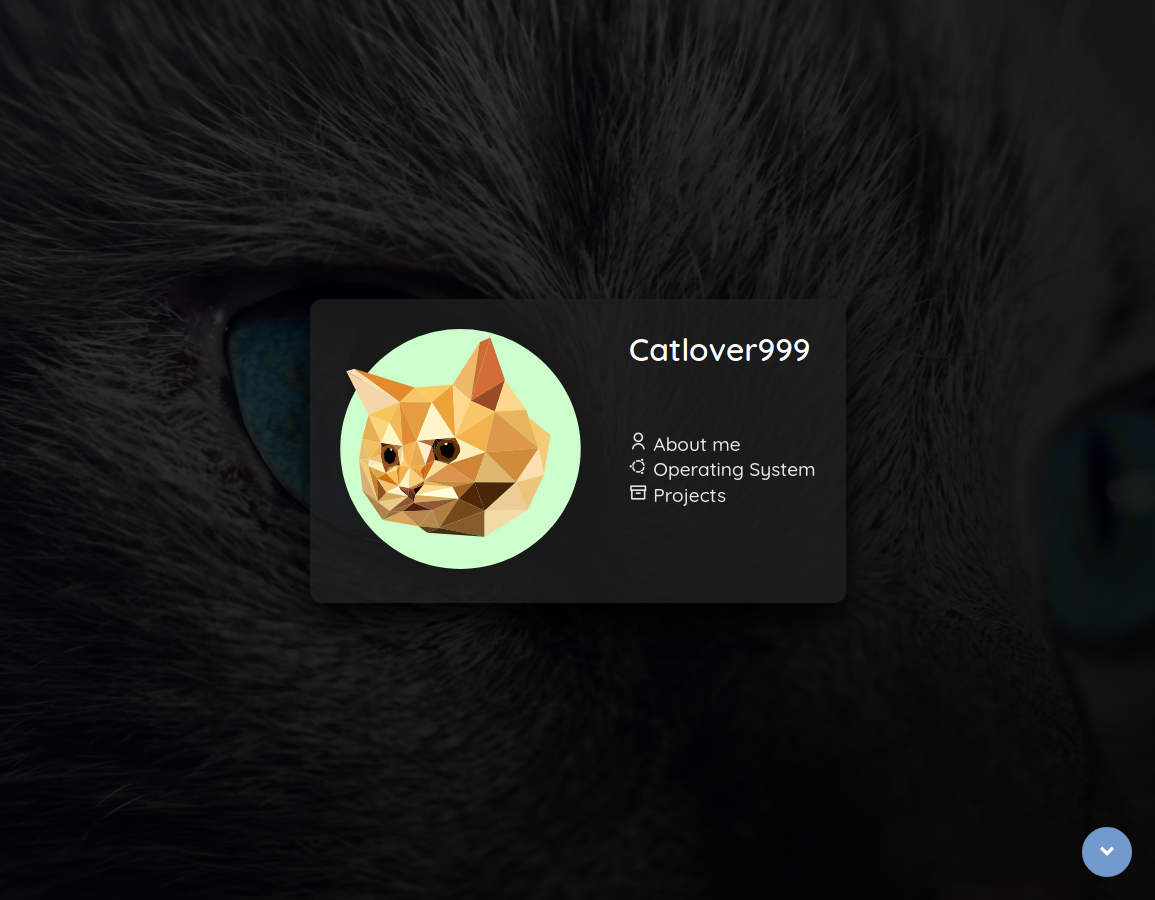
Navbar
Type 1 - Floating
The navigation bar is supposed to look modern and simplistic.
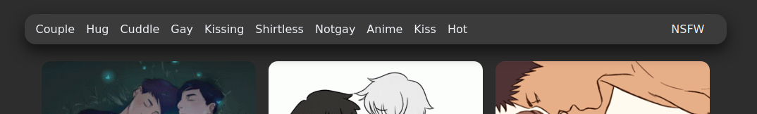
- Floating (sticky) in center (with shadow)
- Width is equal to page size
- Solid color as background-color, no images
- No Images in bar, icons and text only (in textcolor, using alternative colors should be avoided unless absolutely required)
- Tab Switching/Selected makes text bold
Type 2 - Sticky
An alternative type for the Navigation-Bar is like this:
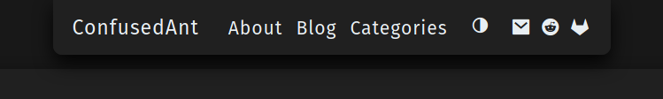
This uses similar design considerations as the Floating-bar, differes in one main way though. Instead of being “free”-floating, it’s attached to the top of the screen. On mobile the sides of the bar merge with the edge of the screen (the roundness is also removed when merging).
Type 3 - Floating with extra settings
Sometimes you just need some quick-settings and some easy to reach toggles. Or you just don’t have enough space in your navigation bar.
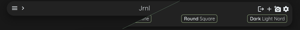
This Navigation bar follows the same design concept as the Type 1 bar. But with the press of a button (in this case the settings-icon), you can expand it to add another row underneath it. This can be very useful when writing a small application, that isn’t big enough, as to require a complete settings-page.
Type 4 - Pull-Down Menu (mobile only)
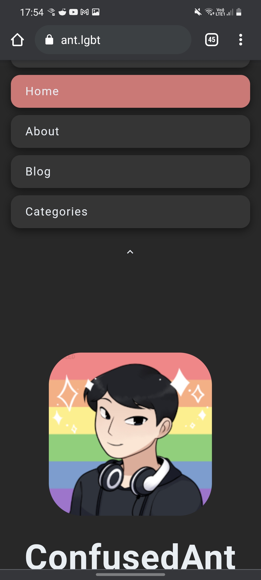
This is something different, that you might want to read more about here: Pull-Down Menu
The concept of it is, to be able to pull down from the top (indicated by a small arrow), and let go when the right one is selected.
You are expected to use something different on a desktop device (which then gets hidden on mobile).
Startpage (aka: Hero)
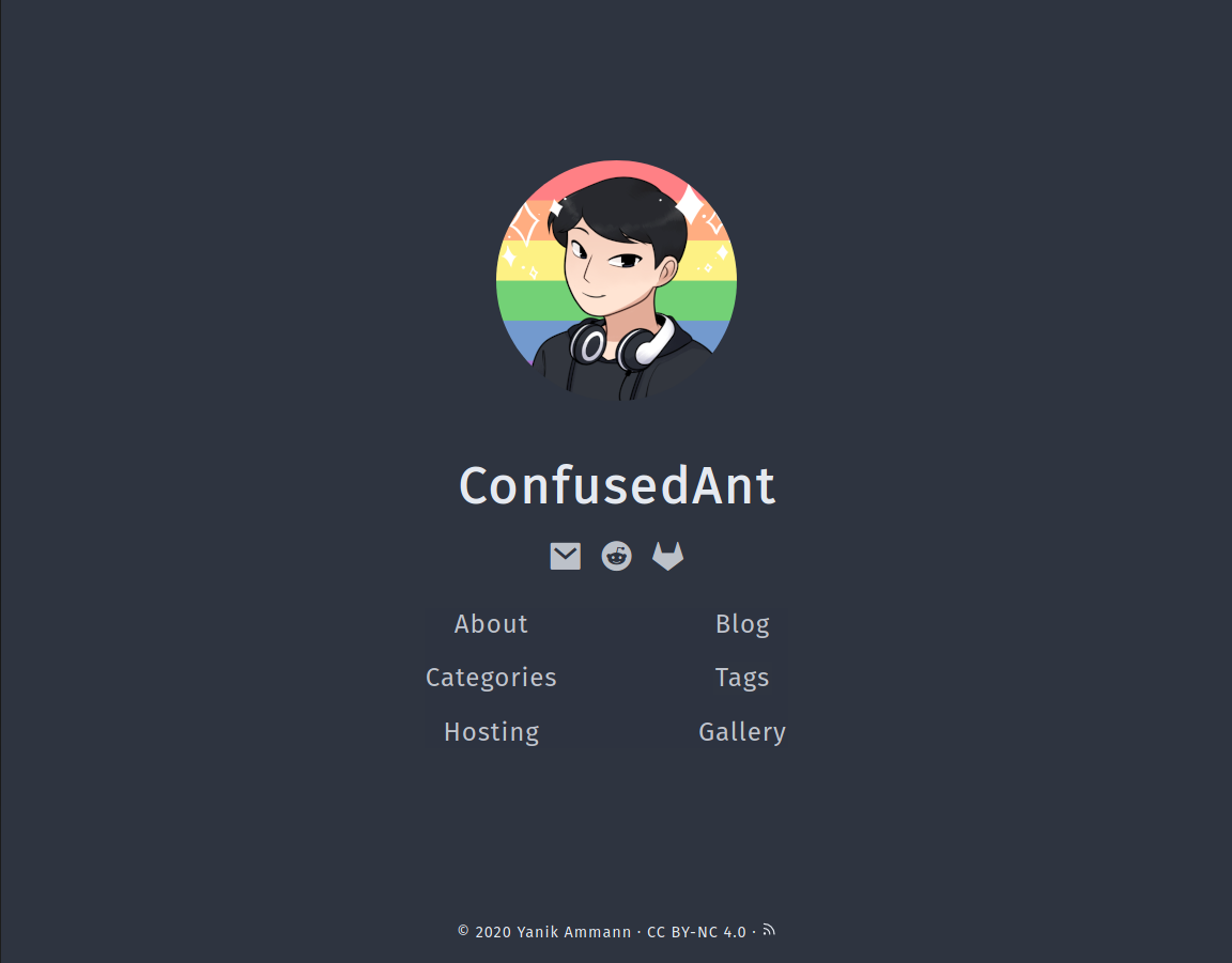
A startpage and a ‘fullscreen hero’ have about the same design-philosophy. They consist of the following criteria:
- A div/box/container in the middle of the screen
- With the logo of the app/website/company being displayed
- Include things such as: title, links to pages, social, …
- A background that is either the same color as the background. If the background is an image, it should blur and/or darken the image in the background, in order to pop out, this effect is to be increased by using a shadow.
- Fill up the entire viewport
- Background either consists of a solid color (
var(--background)), or a image (either darkened, or lightened, depending on the context)
- Background either consists of a solid color (
If you decide to go with the Hero-design, I’d also suggest to include a scroll-up-button. This makes it easier to scroll back up, but mainly serves the purpose of informing the user about the fact, that he can scroll down. This is particularly useful on a OnePage-Website.